Try it on your own data
Every report in this article is in the free plan. One snippet for web and apps, up to 10 sites.
Start freeAn app redesign changes structure, navigation or core flows, and can either remove long-standing friction or reset users’ habits. This guide lists the signals that justify a redesign, eight steps from baseline to staged rollout, and a finance app where a 20% rollout showed better discovery and retention but more support contacts that needed fixing first.
What you will learn
- Redesign only for structural problems
- Set a baseline before changing anything
- Keep event names stable for comparison
- Roll out to a share of users first
- Watch power users and support contacts
What is an app redesign?
An app redesign is a significant change to an app's structure, navigation, visual design or core flows, as opposed to a small UI tweak. Done well, it removes friction users have been living with and makes room for new features. Done badly, it resets habits, hides features people relied on and drops retention for months.
The difference is mostly about evidence: a good redesign starts from data about what users struggle with, is measured against a baseline, and is rolled out in a way that can be stopped.
When an app redesign makes sense
| Signal | What it suggests |
|---|---|
| Navigation-related drop-offs across many flows | Information architecture no longer fits the product |
| Key features with low discovery despite high value | Features are buried |
| Repeated "how do I…" support questions | Labels and flows do not match users' mental models |
| Inconsistent patterns from years of additions | Design debt slows every new feature |
| Platform changes (new OS design language, larger screens) | The app looks and feels outdated |
| Brand repositioning or a new target audience | The app tells the wrong story |
If the problem is one flow, fix that flow. A full redesign is justified when problems are structural.
| Rollout stage | Check before expanding |
|---|---|
| Beta / 5–20% | Crash-free users, core action rate |
| 50% | Retention of new users, support contacts |
| 100% | Power-user behavior, revenue |
Keep a rollback path until the last stage.
How to redesign an app in eight steps
1. Set goals and a baseline
Choose two or three outcome metrics (for example next-day retention, core action rate, task completion) and record at least four weeks of baseline by platform.
2. Gather evidence
Funnels and paths show where users struggle; heatmaps and session recordings show how; support conversations and reviews show what users call things and what they miss.
3. Map what must not break
List the flows power users rely on and the shortcuts they use. Redesigns that remove habitual paths anger the most valuable users first.
4. Prototype and test with users
Test the new navigation and core flows with a handful of real users before building. Task success and time on task are better signals than "do you like it?".
5. Instrument the new version
Keep event names stable where flows are equivalent so before/after comparisons are possible, and add events for new flows.
6. Roll out gradually
Release to a percentage of users, a beta group or one platform first. Keep the ability to roll back.
7. Compare versions
Compare cohorts on the old and new versions on the same metrics: crash-free users, core action rate, retention, support contacts. Watch power users separately.
8. Iterate before full rollout
Fix what the first cohort struggled with, then expand.
Worked example: navigation redesign
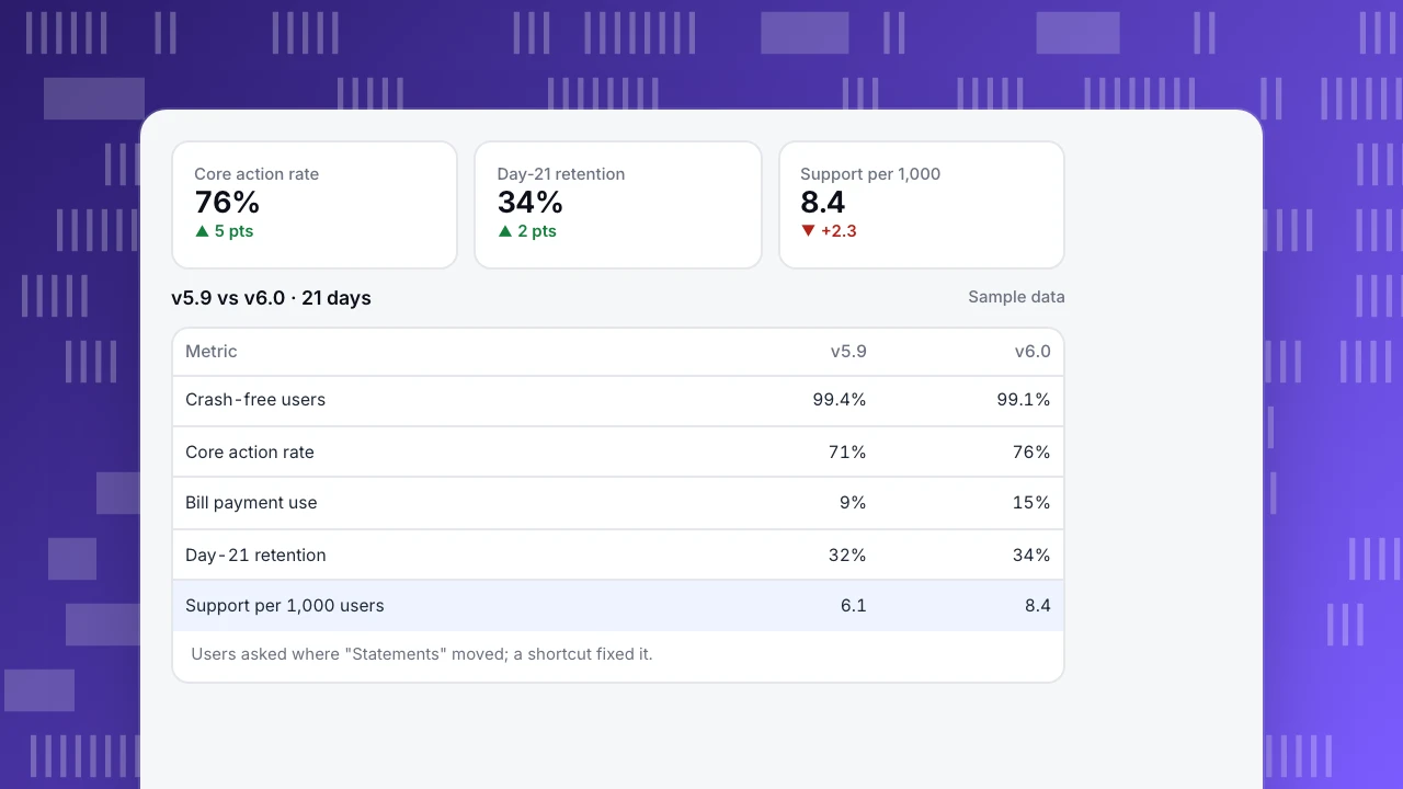
A finance app (sample data) moved from a five-tab bar to a home screen with personalized shortcuts. Version 6.0 was released to 20% of Android users first; comparison over 21 days:
| Metric | v5.9 (80%) | v6.0 (20%) |
|---|---|---|
| Crash-free users | 99.4% | 99.1% |
| Core action rate (viewed account) | 71% | 76% |
| Bill payment feature use | 9% | 15% |
| Day-21 retention (new users) | 32% | 34% |
| Support contacts per 1,000 users | 6.1 | 8.4 |
The redesign improved discovery and retention, but support contacts rose: many messages asked where the "Statements" tab went. The team added a statements shortcut to the default home and a one-time tip for existing users before expanding to 100%. Crash-free users dropped slightly; one new crash on Android 12 was fixed in 6.0.1.
Core action rate
76%
▲ 5 pts
Day-21 retention
34%
▲ 2 pts
Support per 1,000
8.4
▼ +2.3
v5.9 vs v6.0 · 21 days
Sample data| Metric | v5.9 | v6.0 |
|---|---|---|
| Crash-free users | 99.4% | 99.1% |
| Core action rate | 71% | 76% |
| Bill payment use | 9% | 15% |
| Day-21 retention | 32% | 34% |
| Support per 1,000 users | 6.1 | 8.4 |
Users asked where "Statements" moved; a shortcut fixed it.
Common mistakes
- Redesigning for aesthetics alone. Without problems to solve, you only add risk.
- No baseline. You cannot prove the redesign helped.
- Renaming events. Before/after comparisons break when tracking changes with the UI.
- Big-bang releases. A full rollout leaves no control group and no safe exit.
- Ignoring existing users. New users may like the redesign while loyal users struggle.
Measuring an app redesign in TapCub
- Versions: Versions & channels compares active users, new users and crashes per app version, so old and new versions can be compared side by side. See track app versions.
- Stability: crash-free users, ANRs and cold start per version.
- Funnels and paths: core flows before and after, from screen views and events; path analysis shows new navigation patterns.
- Retention and lifecycle: cohorts by first-use date and version.
- Support: live chat conversations in the app show what users cannot find.
Related: mobile app optimization, feature adoption, UX audit.
FAQ
How often should an app be redesigned? Only when problems are structural. Continuous small improvements are usually better than periodic full redesigns.
How do I know if a redesign worked? Compare the new and old versions on the goals set beforehand, with enough users and time, and check stability and support contacts as guardrails.
Should I tell users about a redesign? Yes, briefly. A short in-app note showing where key features moved reduces support contacts and frustration.
Can I A/B test a redesign? Yes, with a staged rollout or feature flags. Keep metrics and events consistent across both versions.
Sources
- Nielsen Norman Group. Radical redesign or incremental change?
- Google Play Console Help. Release app updates with staged rollouts.
- Apple Developer. Phased release for automatic updates.
Was this article helpful?
We use your answers to fix and expand this page.
Couldn’t send. Please try again in a minute.
Thanks for the feedback. We’ll use it to improve this page.You’ve already sent feedback on this page. Thanks.

Product Adoption Consultant
Explores customer onboarding, live conversations, and self-service, turning common usage questions into practical guidance and improvements.