Try it on your own data
Every report in this article is in the free plan. One snippet for web and apps, up to 10 sites.
Start freeA UX audit is a structured review that finds usability problems in a website or app and ranks what to fix. This guide combines a heuristic review with behavioral evidence from funnels, heatmaps, replays, errors and support chats, and includes a checklist with measurable thresholds and a checkout audit that lifted completion from 46% to 53%.
What you will learn
- Scope the audit to a few key flows
- Let funnels show where to look; let heuristics explain why
- Watch 15–30 replays per problem step
- Check speed and errors before blaming design
- Rank issues by severity × reach ÷ effort
What is a UX audit?
A UX audit is a structured review of a website or app that finds usability problems, explains why they hurt users, and ranks what to fix. It combines an expert review against established usability principles with evidence from how real people use the product: analytics, funnels, heatmaps, session replays, errors and support conversations. The result is a prioritized list of issues with recommendations, not a redesign.
An audit identifies problems; it does not fix them. Its value is in pointing a design and engineering team at the few changes that matter most.
When to run a UX audit
- Conversion or retention has dropped and nobody can explain why.
- Before a redesign, to know what to keep and what to change.
- After a major release or a new checkout, sign-up or onboarding flow.
- When support keeps receiving the same "how do I" questions.
- Once or twice a year for key flows, as routine maintenance.
Expert review vs data-driven audit
| Heuristic (expert) review | Data-driven review | |
|---|---|---|
| How | Reviewers walk through flows against principles such as Nielsen's 10 heuristics and WCAG | Analytics, funnels, heatmaps, replays, errors, support logs |
| Finds | Inconsistencies, unclear labels, missing feedback, accessibility gaps | Where users actually struggle and how many are affected |
| Strength | Fast, catches problems before many users hit them | Shows impact and priority |
| Weakness | Subjective; cannot size the problem | Shows where and how much, not always why |
A good audit uses both: data tells you where to look, the expert review explains what is wrong there.
| Severity | Meaning | Example |
|---|---|---|
| High | Blocks or loses many users on a key flow | Validation error on a required field |
| Medium | Slows users down or distracts them | Prominent coupon field at checkout |
| Low | Cosmetic or affects few users | Low-contrast secondary link |
Present the top ten issues first; long unranked lists rarely get fixed.
How to do a UX audit in seven steps
1. Set scope and goals
Choose the flows to audit (for example: landing page to sign-up, product page to checkout) and the business metric each one serves. A whole-site audit with no scope produces a long, unranked list.
2. Collect behavioral data
For each flow gather four weeks of: page and step conversion, exit rates, scroll depth, rage clicks, JavaScript errors and device split. Funnels show which step loses the most people; this is where the audit spends most of its time.
3. Watch real sessions
Pick 15–30 session replays per problem step, filtered to sessions that dropped off or rage-clicked. Note what users tried to do and where they hesitated. Replays turn a drop-off percentage into a concrete behavior.
4. Run a heuristic review
Walk the same flows on desktop and on a phone, checking each screen against usability heuristics: visibility of system status, match with real-world language, user control, consistency, error prevention, recognition over recall, flexibility, minimal design, error recovery, and help. Add an accessibility pass (contrast, focus order, labels, tap targets).
5. Check performance and errors
Slow or broken screens look like usability problems. Review Core Web Vitals and errors for the audited pages before blaming the design.
6. Read support and feedback
Search chat transcripts and tickets for the flow's keywords. Repeated questions are some of the clearest evidence of confusing UX.
7. Prioritize and report
For each issue record: where it occurs, evidence (data and screenshots), affected users, severity, the recommended fix and effort. Rank by severity × reach ÷ effort, and present the top ten first.
UX audit checklist
| Area | Check |
|---|---|
| Navigation | Can a new visitor reach the main tasks in two clicks? Are labels in the users' words? |
| Content | Does each page answer the question that brought people there, above the fold? |
| Forms | Are fields minimal, labeled, with inline validation and clear errors? |
| Feedback | Do buttons show loading and success states? Are errors explained? |
| Mobile | Are tap targets at least 24×24 CSS px, with no horizontal scrolling? |
| Accessibility | Is text contrast at least 4.5:1? Can the flow be completed with a keyboard? |
| Performance | Is LCP under 2.5 s and INP under 200 ms at the 75th percentile? |
| Trust | Are price, delivery, refund and security information visible where decisions happen? |
Worked example: a checkout audit
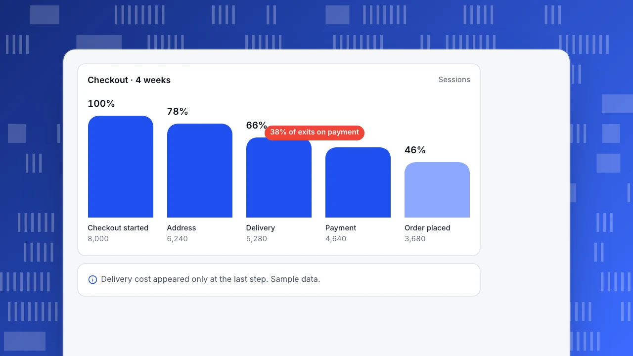
An online store's checkout (sample data, four weeks) converts 46% of people who start it. The audit found:
| Finding | Evidence | Severity | Fix |
|---|---|---|---|
| Delivery cost revealed only at the last step | 38% of exits happen on the payment step; replays show users scrolling back to the cart | High | Show estimated delivery cost in the cart |
| Postcode field rejects spaces | 9% of checkout sessions have a validation error on postcode; rage clicks on "Continue" | High | Accept spaces, normalize on the server |
| Coupon field draws attention | 22% of users click "Apply coupon"; many leave to search for codes | Medium | Collapse the field behind a link |
| Low-contrast "Back" link | Contrast 2.9:1 | Low | Increase contrast |
After the first two fixes, checkout completion rose from 46% to 53% in the next four weeks.
Checkout · 4 weeks
SessionsCheckout started
8,000
Address
6,240
Delivery
5,280
Payment
4,640
Order placed
3,680
Common mistakes
- Opinions without evidence. Every finding needs data, a replay or a principle behind it.
- Auditing only on desktop. Most consumer traffic is mobile, and many problems only appear there.
- Reporting 80 issues with equal weight. Rank them; teams act on the top ten.
- Ignoring performance and bugs. A broken button is not a design problem.
- No follow-up measurement. Re-check the metrics after fixes to confirm the audit was right.
Running a UX audit with TapCub
- Funnels and exits: build a funnel for each audited flow and use Web analytics › Pages for exit pages and bounce.
- Heatmaps and replay: click and scroll heatmaps show what people try to click and where they stop; rage clicks are flagged. Session replay is off by default; when enabled it samples 10% of sessions and masks input values.
- Errors and speed: JavaScript errors and real-user Core Web Vitals per page help separate bugs and slowness from design problems.
- Support: live chat conversations show the pages visitors were on when they asked for help.
See also how to read a heatmap and user friction.
FAQ
How long does a UX audit take? A focused audit of two or three key flows takes one to two weeks, including data collection, replay review, the heuristic pass and the report.
What is the difference between a UX audit and usability testing? An audit reviews an existing product using expert evaluation and existing data. Usability testing observes recruited participants doing tasks. Audits often recommend where usability tests are needed.
What should a UX audit report include? Scope and goals, methods, a ranked list of issues with evidence, severity and recommended fixes, and the metrics to watch after changes.
Can I do a UX audit without a UX designer? Yes for a first pass: data, replays and a heuristic checklist will surface the biggest problems. A designer helps with the recommendations and with subtler issues.
See also: Mobile app usability testing: tasks, metrics and a study plan.
Sources
- Nielsen Norman Group. 10 usability heuristics for user interface design.
- W3C. Web Content Accessibility Guidelines (WCAG) 2.2.
- Baymard Institute. Checkout usability research.
Was this article helpful?
We use your answers to fix and expand this page.
Couldn’t send. Please try again in a minute.
Thanks for the feedback. We’ll use it to improve this page.You’ve already sent feedback on this page. Thanks.

Product Adoption Consultant
Explores customer onboarding, live conversations, and self-service, turning common usage questions into practical guidance and improvements.