Try it on your own data
Every report in this article is in the free plan. One snippet for web and apps, up to 10 sites.
Start freeTo optimize images for the web, first serve each image at the size it is displayed (srcset and sizes) and load the main above-the-fold image first, without lazy loading. Format and compression come second. When the LCP element is an image, fixing that one file moves load time the most. Below: the order, a worked example and checks.
What you will learn
- Fix dimensions first: an image twice its display width carries four times the pixels
- Never lazy-load the hero; give the LCP image fetchpriority="high" and width/height
- Then use WebP or AVIF and compress, and confirm with real-user LCP at P75
How to optimize images for web: the order that matters
Most image guides start with formats and compression tools. Those matter, but they are not where the biggest savings usually are. Work in this order:
- Serve the right dimensions. An image displayed 1,200 pixels wide should not be downloaded 2,400 pixels wide. Doubling the width quadruples the pixels.
- Let the browser choose per device with
srcsetandsizes, so a phone does not download the desktop file. - Load the hero image first and everything below the fold later. No lazy loading on the main above-the-fold image,
fetchpriority="high"on it, andloading="lazy"on the rest. - Reserve space with
widthandheightattributes so images do not push content around as they load. - Pick a modern format: WebP or AVIF for photos, with a JPEG or PNG fallback where needed, and SVG for logos and icons.
- Compress at the lowest quality setting that still looks right.
- Cache and deliver with long cache lifetimes and a CDN or image service that resizes on the fly, if your traffic justifies one.
Steps 1 to 3 decide most of what a visitor actually waits for. Steps 5 and 6 then shave what is left. The rest of this guide explains why, with a worked example.
Why the LCP image matters most
On many pages the largest element in the first screen is an image: a hero photo, a product shot, a banner. When it is, that image sets the page's Largest Contentful Paint (LCP), the moment the main content appears. A good LCP is 2.5 seconds or less at the 75th percentile of real page loads.
web.dev splits LCP into four parts, with rough targets for a well-optimised page:
| LCP part | What happens | Rough target share |
|---|---|---|
| Time to first byte | The server responds with the HTML | About 40% |
| Resource load delay | Gap between the first byte and the browser starting to fetch the image | Under 10% |
| Resource load duration | Downloading the image itself | About 40% |
| Element render delay | Gap between the image arriving and it being painted | Under 10% |
Image optimisation acts on the middle two rows. Wrong dimensions and heavy formats inflate load duration. Lazy loading the hero, or hiding it in a CSS background or a JavaScript carousel, inflates load delay, because the browser discovers the image late or deliberately waits. Fixing that one image moves LCP directly. Shrinking a dozen thumbnails further down the page does not move LCP at all, though it still saves data.
So before optimising anything, find out which element is the LCP element. Chrome DevTools' Performance panel and Lighthouse both name it.
Step 1: serve the right dimensions with srcset and sizes
Find the largest size each image is actually displayed at, in CSS pixels, and multiply by the device pixel ratio you want to support. A hero displayed at most 1,200 CSS pixels wide on desktop needs 1,200 pixels on a standard screen and 2,400 on a 2x screen. A phone that displays it 390 CSS pixels wide needs 780 pixels at 2x and 1,170 at 3x.
Then give the browser options and let it choose:
<img
  src="hero-1200.jpg"
  srcset="hero-800.jpg 800w, hero-1200.jpg 1200w,
          hero-1600.jpg 1600w, hero-2400.jpg 2400w"
  sizes="(max-width: 600px) 100vw, 1200px"
  width="1200" height="675"
  alt="Ceramic mugs on a wooden shelf">
srcset lists the files and their real widths. sizes tells the browser how wide the image will be displayed at each viewport. The browser combines that with the screen's pixel density and picks the smallest file that is sharp enough. MDN's responsive images guide covers art direction with <picture> for cases where the crop, not just the size, should change on phones.
If your CMS or framework generates these variants for you, check what it actually outputs. A common failure is a srcset with correct files but a missing or wrong sizes, which makes the browser assume the image fills the whole viewport and pick a file that is too large.
Step 2: load the hero first, lazy-load the rest
The browser decides when to fetch each image. Three attributes control that decision:
loading="lazy"waits until an image is near the viewport. It is right for images below the fold and wrong for the hero: web.dev's guidance is never to lazy-load the LCP image, because it always adds load delay.fetchpriority="high"tells the browser to fetch an image ahead of other resources. Use it on the one image most likely to be the LCP element. Marking several images high cancels the benefit.<link rel="preload">helps when the hero is referenced only from CSS or JavaScript, where the browser cannot find it while parsing the HTML. A plain<img>in the HTML is better still.
Also set width and height (or a CSS aspect-ratio) on every image. The browser then reserves the right space before the file arrives, so text does not jump down when the image loads. That jump counts toward Cumulative Layout Shift.
Worked example: one 2,400 px hero image
Sample data. A store's homepage hero is a 2,400 × 1,350 JPEG weighing 1,150 KB. It is displayed at most 1,200 CSS pixels wide, has loading="lazy" from a theme default, and is the LCP element. On the test connection it downloads at about 6.6 Mbps, so the file takes 1,400 ms.
Bytes. At a fixed quality setting, file size grows roughly with pixel count. That is an approximation, but good enough to compare options:
| Version | Pixels | Share of original | Approx. size |
|---|---|---|---|
| 2400w (original) | 3.24 MP | 100% | 1,150 KB |
| 1600w | 1.44 MP | 44.4% | 511 KB |
| 1200w | 0.81 MP | 25.0% | 288 KB |
| 800w | 0.36 MP | 11.1% | 128 KB |
Now compare four routes:
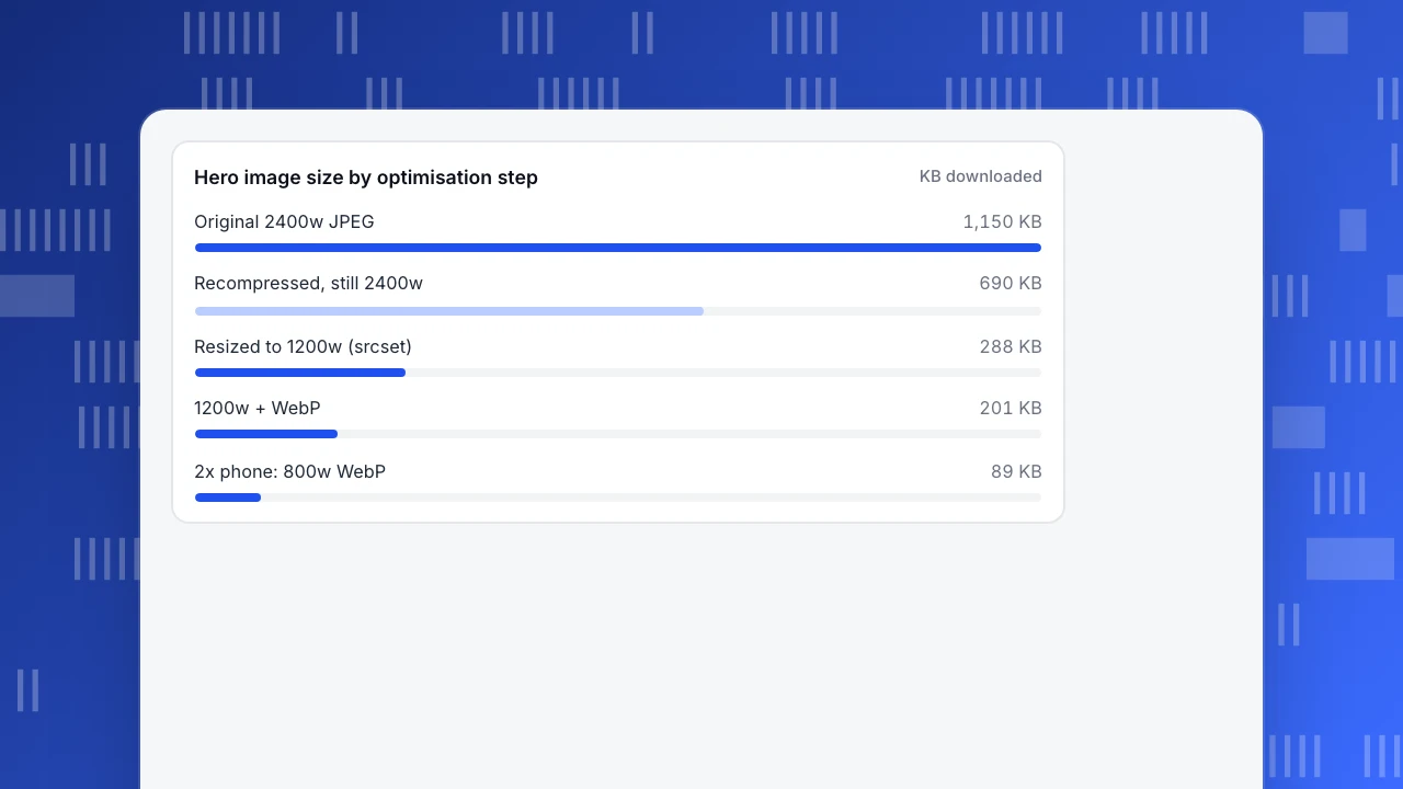
- Compress only (keep 2,400 px, re-encode at a lower quality, assume −40%): 1,150 × 0.6 = 690 KB.
- Resize only (srcset, desktop 1x gets 1200w): 288 KB, a 75% saving.
- Resize, then convert to WebP (assume a further −30% at similar visual quality): 288 × 0.7 = 201 KB, 82.5% below the original.
- A 2x phone (390 CSS px × 2 = 780 px needed, so it picks 800w, also WebP): 128 × 0.7 = 89 KB.
The −40% and −30% figures are assumptions for this example. Real savings depend on the image, so measure your own with the same visual check.
LCP. Before the fix, the parts are 600 ms to first byte, 900 ms load delay (lazy loading plus late discovery), 1,400 ms load duration and 100 ms render delay: 3,000 ms, which is poor territory.
- Compress only, still lazy: 600 + 900 + (1,400 × 0.6 = 840) + 100 = 2,440 ms.
- Priority only (remove lazy, add
fetchpriority="high", load delay falls to 100 ms), file unchanged: 600 + 100 + 1,400 + 100 = 2,200 ms. - Priority plus resize plus WebP: load duration scales to 1,400 × 201 ÷ 1,150 = 245 ms, so 600 + 100 + 245 + 100 = 1,045 ms.
Compression alone left the page at 2,440 ms. Fixing dimensions and priority on this one image took it to 1,045 ms. The chart after this section shows the byte side of the same story.
Hero image size by optimisation step
KB downloadedStep 3: pick the format
Formats are the next lever once dimensions and priority are right. MDN's image format guide summarises the trade-offs:
- Photos: WebP or AVIF usually compress better than JPEG at similar quality. JPEG remains a safe fallback.
- Screenshots, diagrams and line art: lossless formats such as PNG, or lossless WebP, keep edges sharp.
- Logos and icons: SVG, whenever a vector version exists. It scales to any screen without extra files.
- Animation: WebP, AVIF or a short video instead of a large GIF.
Where older browsers matter, serve modern formats with a fallback:
<picture>
  <source type="image/avif" srcset="hero-1200.avif 1200w, hero-800.avif 800w" sizes="(max-width: 600px) 100vw, 1200px">
  <source type="image/webp" srcset="hero-1200.webp 1200w, hero-800.webp 800w" sizes="(max-width: 600px) 100vw, 1200px">
  <img src="hero-1200.jpg" width="1200" height="675" alt="Ceramic mugs on a wooden shelf">
</picture>
The browser takes the first <source> it supports and falls back to the <img>. The format comparison table after this section lists what each format is good at.
| Format | Best for | Compression | Transparency / animation |
|---|---|---|---|
| JPEG | Photos (fallback) | Lossy | No / no |
| PNG | Screenshots, diagrams, images needing transparency | Lossless | Yes / no (APNG adds animation) |
| WebP | Photos and graphics; replaces JPEG, PNG and GIF in most cases | Lossy or lossless | Yes / yes |
| AVIF | Photos where smallest size matters | Lossy or lossless, usually smaller than WebP | Yes / yes |
| SVG | Logos, icons, diagrams | Vector (text-based) | Yes / via CSS or SMIL |
| GIF | Legacy simple animations | Lossless, 256 colours | One transparent colour / yes |
Summary of MDN's image file type and format guide. Serve WebP or AVIF with a JPEG or PNG fallback inside
Step 4: compress without visible loss
Compression is a trade between bytes and visible quality, and the right setting differs per image. A practical routine:
- Start lower than you think. Export a photo at quality 75–80 in JPEG or WebP and compare it with the original at 100% zoom, not shrunk to fit your screen.
- Look at the hard parts: faces, skin, sky gradients, fine text. Banding and blocky edges show up there first.
- Strip metadata. Camera EXIF data, colour profiles you do not need and GPS coordinates add bytes, and GPS can reveal where a photo was taken.
- Do not re-compress a compressed file repeatedly. Each lossy save adds artefacts. Keep a high-quality master and export from it.
- Automate it in your build or upload pipeline so new images get the same treatment.
For one-off batches, TapCub's free image compressor runs in the browser: drop in up to 60 JPG, PNG or WebP files, set a quality, a maximum size or a target file size, convert to WebP or AVIF, compare before and after, and download. Nothing is uploaded, and EXIF and GPS data are stripped.
Delivery is the last step. Long cache lifetimes on versioned image URLs mean returning visitors download nothing. An image CDN can resize and convert on request, which saves build-time work on large catalogues; whether one pays off depends on your traffic, and the order above still applies to what it serves.
How to check that it worked
Check in two places.
- Lab check, straight after the change. Run Lighthouse or a page speed test on the page. Confirm the LCP element is still the image you optimised, that it is no longer lazy-loaded, and that the image audits no longer list it as oversized.
- Field check, over the following weeks. Compare the 75th percentile of LCP from real visitors before and after, on the pages you changed, split by mobile and desktop. Phones on slower networks usually gain the most from smaller files.
How fast is fast enough, and how LCP relates to other load metrics, is covered in what is a good page load time and website performance metrics. If images are fine but the page is still slow, look at scripts: see how to minimize main thread work and why websites load slowly.
How to check image fixes in TapCub
Take the store from the example: a lazy-loaded 2,400 px hero, now resized, converted and prioritised. TapCub shows whether real visitors' LCP moved.
- Find the pages worth fixing. In Monitoring › Performance, the Slowest pages list is sorted by P75 largest contentful paint. Image-heavy templates such as home, category and product pages tend to sit near the top.
- See which visitors wait. Break the LCP trend down by device. If mobile P75 is far above desktop, oversized files on phones are a likely cause, and the srcset step matters most.
- Separate server time from download time. The load timing view splits a page load into backend (time to first byte), network transfer and frontend render. A hero fix should shrink transfer; if backend dominates, images are not your main problem.
- Compare before and after. The page has no previous-period comparison, so note the P75 for the weeks before the release, then read the same number of weeks after it. Pages with few samples jump around, so wait until both ranges have enough loads.
TapCub records LCP values, not which element was the LCP element; confirm that the hero is the LCP element in DevTools or Lighthouse. Checking Core Web Vitals in TapCub explains the screen in detail.
FAQ
What is the best image format for the web?
There is no single answer. For photos, WebP or AVIF usually give smaller files than JPEG at similar quality; keep JPEG as a fallback if older browsers matter. Use PNG or lossless WebP for screenshots and diagrams, and SVG for logos and icons. Format is the second step, though: an image served at twice its display size wastes more bytes than any format choice saves.
What size should images be for a website?
Size each image to the largest width it is displayed at, multiplied by the pixel density you support. A hero shown 1,200 CSS pixels wide needs 1,200 px for standard screens and 2,400 px for 2x screens. Generate several widths and let srcset and sizes pick per device, so phones download the 800 px version instead of the desktop file.
How do I compress images without losing quality?
Export from a high-quality master at quality 75–80 in JPEG or WebP, then compare against the original at 100% zoom, looking at faces, gradients and text. If you cannot see a difference, try lower. Strip EXIF and GPS metadata, avoid re-saving already compressed files, and use lossless compression for screenshots and diagrams where sharp edges matter.
Should I lazy load all images?
No. Lazy-load images below the fold, but never the main image in the first screen. web.dev advises against lazy-loading the LCP image because it delays its download. In the worked example, removing lazy loading and adding fetchpriority on the hero cut LCP from 3,000 to 2,200 ms before any resizing. Add width and height to every image either way.
Does image optimization help SEO?
Indirectly. Google recommends good Core Web Vitals, and an optimised hero image is often the quickest way to improve LCP. Descriptive file names and alt text help images appear in image search and make pages accessible. Optimisation will not lift a page that does not answer the search, but a slow LCP can hold back one that does.
See also: Expires Header and Cache-Control: What to Set and How to Check.
See also: CDN cache: how it works and how to check your hit ratio.
Sources
Was this article helpful?
We use your answers to fix and expand this page.
Couldn’t send. Please try again in a minute.
Thanks for the feedback. We’ll use it to improve this page.You’ve already sent feedback on this page. Thanks.

Data Engineer
Writes about event design, data quality, and collection workflows, with verifiable implementation methods for reliable analytics.