Try it on your own data
Every report in this article is in the free plan. One snippet for web and apps, up to 10 sites.
Start freeMobile search engine optimization is making the phone version of a page complete, fast and tappable, because that is the version Google indexes. Check three things: content present on mobile, Core Web Vitals passing for real phone visits, and a layout people can tap and read. Below: a parity table, a speed-priority example and a ten-minute audit.
What you will learn
- Only content shown on the mobile page is indexed, so mobile must match desktop
- Pass Core Web Vitals at the 75th percentile of real phone visits, not on average
- Fix pages by seconds over the threshold × mobile sessions, not by the home page first
What is mobile SEO, and why does the mobile page decide your ranking?
Mobile search engine optimization, or mobile SEO, is making sure the version of your page that a phone sees is complete, fast and easy to use, because that is the version search engines use. Google's documentation on mobile-first indexing is direct about it: only the content shown on the mobile site is used for indexing, and a mobile page with less content than the desktop page can lead to traffic loss.
That one rule explains most of what follows. Mobile SEO is not a separate list of tricks. It is three questions asked of the mobile page:
- Rendering: is everything that should rank actually present and crawlable on the phone version?
- Speed: does it load and respond within the thresholds for real phones on real connections?
- Tappable experience: can a person read it, tap it and finish the task without zooming or hunting?
The related guides cover pieces in depth: mobile UX for design, page speed and SEO for loading and JavaScript SEO for rendering. This one shows how to check all three in one pass and which to fix first.
What must match between your mobile and desktop pages?
Google's guidance lists what to keep equivalent. Use it as a checklist, comparing the mobile page against the desktop page for each row:
| Check | What to compare | What goes wrong |
|---|---|---|
| Main content | Text, images, video, tables | Content hidden or cut on mobile is not indexed |
| Headings | Same clear headings | Sections lose structure |
| Structured data | Same markup on both | Rich results disappear or mismatch |
| Robots meta tags | Same index and follow settings; no noindex on mobile only | Mobile pages drop out |
| Title and meta description | Equivalent on both | Snippets change unpredictably |
| Image alt text and URLs | Same alt text, stable image URLs | Image search traffic dips |
| Lazy loading | Primary content does not wait for a swipe, click or typing | Google does not trigger those interactions, so it never sees the content |
| Blocked resources | Mobile CSS, JavaScript and images not disallowed in robots.txt | Google renders a broken page |
Content can be reorganised on a small screen: accordions and tabs are acceptable, because the content is still there. What fails is removing it. A common version of this is a long desktop table replaced by a summary on mobile, or reviews that only load after a tap.
| Check | Compare on mobile and desktop | Failure |
|---|---|---|
| Main content | Text, images, video, tables | Hidden content is not indexed |
| Structured data | Same markup | Rich results mismatch |
| Robots meta tags | No mobile-only noindex | Page drops out |
| Lazy loading | Primary content not behind a tap | Never seen by Google |
| Blocked resources | CSS, JS and images allowed | Broken render |
Content can be reorganised into accordions or tabs; it cannot be removed.
Can search engines actually see your mobile content?
Two failures hide content without anyone noticing:
- Content that loads on interaction. A "read more" that fetches text only when clicked, or a product description that appears after a scroll listener fires. Google's guidance is blunt: do not lazy-load primary content upon user interaction. Load it in the page and use collapse styling if you want it tucked away.
- Blocked or failing resources. If the scripts or styles needed to build the mobile page are blocked, the crawler sees a different page from the one visitors see. Let Google crawl your resources.
A quick test: load the page on a phone, or in a browser with mobile emulation, switch off the interactions and look at what remains in the initial HTML. Anything you want ranked should be in it or appear without a click. For deeper cases, such as client-side rendered apps, see JavaScript SEO.
Is the page fast enough on a phone?
The standard measure is the Core Web Vitals. The thresholds, published on web.dev, are:
| Metric | What it measures | Good |
|---|---|---|
| Largest Contentful Paint (LCP) | How quickly the main content shows | 2.5 seconds or less |
| Interaction to Next Paint (INP) | How quickly the page responds to taps and clicks | 200 milliseconds or less |
| Cumulative Layout Shift (CLS) | How much the layout jumps | 0.1 or less |
They are assessed at the 75th percentile of page loads, separately for mobile and desktop. That means three-quarters of real phone visits must meet the threshold: a fast average hides a slow quarter.
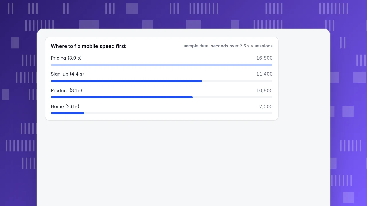
Sample data: the same page set looks different on phones. Take five pages and their mobile 75th-percentile LCP:
| Page | Mobile sessions | Mobile LCP (P75) | Meets 2.5 s? | Seconds over × sessions |
|---|---|---|---|---|
| Pricing | 12,000 | 3.9 s | No | 1.4 × 12,000 = 16,800 |
| Product | 18,000 | 3.1 s | No | 0.6 × 18,000 = 10,800 |
| Sign-up | 6,000 | 4.4 s | No | 1.9 × 6,000 = 11,400 |
| Home | 25,000 | 2.6 s | No | 0.1 × 25,000 = 2,500 |
| Guide | 30,000 | 2.4 s | Yes | 0 |
Total mobile sessions: 12,000 + 18,000 + 6,000 + 25,000 + 30,000 = 91,000. Sessions on pages missing the threshold: 12,000 + 18,000 + 6,000 + 25,000 = 61,000, so 61,000 ÷ 91,000 = 67.0% of mobile sessions land on a page that is too slow. The last column ranks the work: pricing (16,800), sign-up (11,400), product (10,800), home (2,500). Pricing comes first even though the guide has more traffic, because it is far over and heavily visited, and the home page, 0.1 seconds over, can wait.
Where to fix mobile speed first
sample data, seconds over 2.5 s × sessionsCan people tap and read the page?
Search engines cannot measure frustration directly, but the layout problems behind it are checkable:
- Tap targets. Lighthouse flags a target smaller than 48 by 48 pixels only when at least 25% of its area within 48 pixels of its centre overlaps another target, and notes 8 pixels of spacing is a good start but not always enough. Check navigation, filters and footers first.
- Resizable text. Text should be resizable to 200 percent without losing content or function (WCAG 1.4.4). A fixed-width layout that forces horizontal scrolling at that size is a fail.
- Ads and pop-ups. Google asks that ads not harm the mobile page; a full-screen overlay on arrival is the usual culprit.
- The task itself. Can a visitor find the price, start sign-up or reach a contact route in two taps from a landing page?
Fixing these rarely moves a ranking by itself. They matter because they decide whether a ranked page converts, and a good rank with a hard-to-use page is wasted.
Should you use a responsive site or separate mobile URLs?
| Setup | What it means | Mobile SEO consequence |
|---|---|---|
| Responsive | One URL, one HTML, layout adapts | Nothing to keep in step: content parity is automatic |
| Separate mobile URLs (m-dot) | A second site for phones | The desktop URL must be canonical and the mobile URL its alternate; redirects, status codes and structured data must match, and the mobile host must handle the crawl rate |
Google's guidance for separate URLs adds specific rules: do not redirect different desktop pages to one mobile page or the home page, keep the same error status on both, avoid URL fragments on mobile pages and verify both versions in Search Console. If you still run an m-dot site, the parity table above applies twice as hard, because the two versions can drift apart.
What does a ten-minute mobile SEO audit look like?
- Pick five pages: your top landing page from search, a product or service page, a form page, a guide, the home page.
- Compare content. On a phone, check each against desktop using the parity table. Note any section that is missing or only appears after a tap.
- Check robots rules. Confirm no
noindexon mobile only and that scripts, styles and images are not blocked. - Read real-user speed. For each page, find the mobile 75th-percentile LCP, INP and CLS, not a lab score on a fast laptop.
- Try to finish the task with one thumb: find the price, press a button, fill a field.
- Rank the fixes with seconds over threshold × mobile sessions, as in the example, and fix the top item first.
What do people get wrong about mobile SEO?
- Treating mobile as a smaller desktop. Trimming content for a short screen removes what gets indexed.
- Testing on one good phone. The threshold is the 75th percentile of real visits, including slow devices and networks.
- Judging speed by the average. A mean can look fine while a quarter of visits are slow.
- Hiding content behind interactions. If it needs a tap to exist, search engines may never see it.
- Fixing the home page first. Fix the pages where slow and busy overlap.
- Forgetting structured data on the mobile version. It must be the same on both.
How do you check this in TapCub?
Take the five-page example. TapCub shows the real-user side of it, and it does not crawl your site or compare mobile and desktop content, so the parity table stays a manual check. For the speed and behaviour half:
- Open Monitoring › Performance. The numbers come from real page loads in visitors' browsers. Switch the card to P75 and break down by device to see mobile against desktop, then by page.
- Use the Slowest pages list, sorted by P75 largest contentful paint, to find the pages like pricing and sign-up in the example. Compare it with Web analytics › Pages to see which are also busy.
- Open All-platform analytics › Behavior › Heatmaps, choose a page and the mobile device. Clicks, Rage clicks and Scroll reach show where phone visitors tap repeatedly and how far down they read; a viewport width filter narrows it further.
- Open Monitoring › Errors and expand an error group to see the device of each occurrence; a script error that only occurs on phones can break a mobile page without touching desktop.
- Connect a search account and use Monitoring › Search performance to compare clicks and position for the pages you fixed, remembering the data runs one to three days behind.
FAQ
What is mobile SEO?
Mobile SEO is making the phone version of your pages complete, fast and usable, because search engines index the mobile version. It covers content parity with desktop, crawlable resources, Core Web Vitals on real phones and layouts that can be tapped and read.
What is mobile-first indexing?
It means Google uses the mobile version of a page for indexing and ranking. Only the content shown on the mobile site is used, so a mobile page with less content than desktop can lose traffic. Content may be reorganised, for instance into accordions, but it should still be present.
Do I need a separate mobile site?
No. A responsive site, where one URL adapts to the screen, is the simpler option because content and markup cannot drift apart. If you keep separate mobile URLs, mark the desktop URL as canonical, link the mobile one as an alternate and keep redirects and status codes matched.
What are the Core Web Vitals thresholds for mobile?
Good is LCP at 2.5 seconds or less, INP at 200 milliseconds or less and CLS at 0.1 or less, measured at the 75th percentile of page loads and assessed separately for mobile and desktop. Check them with real-user data, not just a one-off lab test.
How do I check whether my site is mobile friendly?
Load key pages on a real phone and compare content with desktop, check robots rules, read real-user LCP, INP and CLS for mobile, test that tap targets are at least 48 pixels or well spaced, and try finishing a task with one thumb.
Sources
- Google Search Central. Mobile-first indexing best practices: content parity, structured data, robots tags, lazy loading and separate-URL rules. Verified 2026-11-19.
- web.dev. Web Vitals: LCP 2.5 s, INP 200 ms, CLS 0.1 at the 75th percentile. Verified 2026-11-19.
- Chrome for Developers. Lighthouse: tap targets: 48 by 48 pixel size and overlap rule. Verified 2026-11-19.
- W3C. Web Content Accessibility Guidelines 2.2: success criterion 1.4.4 Resize Text. Verified 2026-11-19.
Was this article helpful?
We use your answers to fix and expand this page.
Couldn’t send. Please try again in a minute.
Thanks for the feedback. We’ll use it to improve this page.You’ve already sent feedback on this page. Thanks.

Product Analyst
Focuses on event analysis, conversion funnels, and retention, using clear metric definitions and structured analysis to explain product performance.