Try it on your own data
Every report in this article is in the free plan. One snippet for web and apps, up to 10 sites.
Start freeAn About Us page works when it answers three questions in order: who you are, why a visitor should trust you, and what to do next. The examples below apply that to five types of business, a rewrite table turns vague sentences into checkable ones, and a worked example shows how to measure the page without being fooled by the fact that interested visitors go looking for it.
What you will learn
- Answer who you are, why trust you and what next, in that order, with one next step
- Replace adjectives with facts a visitor can check: dates, real names, sources, contact details
- Measure the page's own next-step rate before and after a change, not the raw gap between readers and non-readers
What should an About Us page answer?
An About Us page answers three questions, in this order:
- Who are you? What you do, for whom, and where you are, in a few plain sentences.
- Why should I trust you? Real people, a track record you can check, honest limits.
- What do I do next? One clear action: contact you, see the product, read the work.
Nielsen Norman Group's research into corporate About Us content found that visitors want these sections to be clear, authentic and transparent, and that they try to learn an organisation's purpose, location, mission, values and history and how to contact it. The group of visitors is wider than customers: partners, journalists, job seekers and investors all land there. Stanford's web credibility guidelines make the same point from the trust side: show that a real organisation stands behind the site, make it easy to contact you, and show the people and expertise.
The About page is therefore not a place for slogans. It is a verification page. Visitors read it when they are close to deciding and need a reason to believe you.
What are the five blocks every About Us page needs?
Almost every effective About page is built from the same five blocks. Use this table as a checklist:
| Block | The question it answers | What to put in it | Evidence that makes it credible |
|---|---|---|---|
| Summary | Who are you, in 30 seconds? | Two or three sentences: what you do, for whom, since when | Concrete nouns, no adjectives |
| Story | Why do you exist? | The problem you ran into and what you changed | Dates, places, a real decision |
| Proof | Can I check this? | Customer outcomes, certifications, press, years in business | Named sources and links |
| People | Who is behind this? | Photos and short bios of real team members | Real names and roles |
| Next step | What do I do now? | One link or button, plus contact details | A working address, email or phone |
NN/G also recommends putting a short summary at the top of the main About Us page and moving long topics (history, leadership, careers) to their own sub-pages, so the main page stays quick to read. Testimonials help only when they look balanced; visitors suspect curated reviews.
Order matters because visitors scan rather than read every word, as Nielsen's research on how users read on the web found. Put the summary first, keep paragraphs short and let the first sentence of each block carry its point. A visitor who reads only the first line of each block should still learn who you are, one reason to trust you and what to do next. If that test fails, the page is too long or too vague.
| Block | The question it answers | Evidence that makes it credible |
|---|---|---|
| Summary | Who are you in 30 seconds? | Concrete nouns, no adjectives |
| Story | Why do you exist? | Dates, places, a real decision |
| Proof | Can I check this? | Named sources and links |
| People | Who is behind this? | Real names and roles |
| Next step | What do I do now? | A working address, email or phone |
Move long history, leadership and careers to sub-pages so the main page stays quick to read.
What do About Us pages look like for different businesses?
The examples below are invented for illustration. They show the structure; replace the bracketed items with your own facts.
Local service business (a dental clinic)
"[Clinic name] is a [number]-chair family clinic in [town], open since [year]. We started because [specific reason: a long wait you personally had, a gap in the area]. Meet the team: [names, roles, photos]. Questions? Call [number] or book online." Next step: Book a visit.
SaaS company
"We build scheduling software for clinics with [number] to [number] staff. We began after [founder's real situation]. Today [number] clinics use it; here is how we measure the result [link to method]. Our team is in [cities]." Next step: Start free or See the product.
Ecommerce brand
"We make [product] in [place]. Each batch is [process you can verify]. Returns are free within [number] days, and here is the policy. Questions? [email]." Next step: Shop the range. This ties directly into ecommerce trust signals.
Consultancy or agency
"[Name] and [name] advise [type of client] on [one subject]. Recent work: [project, outcome, with the client's permission]. How we work: [three steps]." Next step: Book a 20-minute call.
Nonprofit
"We exist to [one-sentence purpose]. In [year] we [measured output]. [Percentage] of spending went to [programme], reported in [annual report link]. Board: [names]." Next step: Donate or Volunteer.
Notice what the five have in common: a real place or date, a named person or document, and exactly one next step. None of them says "passionate" or "innovative".
How do you rewrite a weak About Us page?
Weak pages rarely lack information; they hide it behind adjectives. Rewrite sentence by sentence:
| Weak version | Why it fails | Stronger version |
|---|---|---|
| "We are passionate about delivering innovative solutions." | Says nothing a visitor can check | "We make scheduling software for dental clinics with 3 to 12 staff." |
| "Our team of experts is here to help." | No names, no faces | "[Name] (support lead) answers most emails within [time]; here is their photo." |
| "Trusted by thousands." | No source | "[Number] clinics use [product]; the list of those who agreed is here." |
| "Contact us for more information." | No action, no details | "Call [number] weekdays 9 to 5, or book a 20-minute call." |
| 400-word company history | Buries the point | Two-sentence summary on this page, full history on its own page |
If you show staff, use real names and photos, with their permission. For the layout of the page around these blocks, see website layout.
Does the About page actually help conversion? A worked example
Sample data: a site had 10,000 sessions in a month, and 1,200 visitors viewed the About page. Of those, 96 later booked a call (8.0%). Of the 8,800 who did not view it, 264 booked (3.0%).
The naive reading is a 167% lift: 8.0% ÷ 3.0% − 1 = 166.7%. That is almost certainly overstated. People who go looking for the About page are already considering you, so they were more likely to book anyway. This is a selection effect, and it means the raw gap tells you the page is where interested people go, not that the page created the interest.
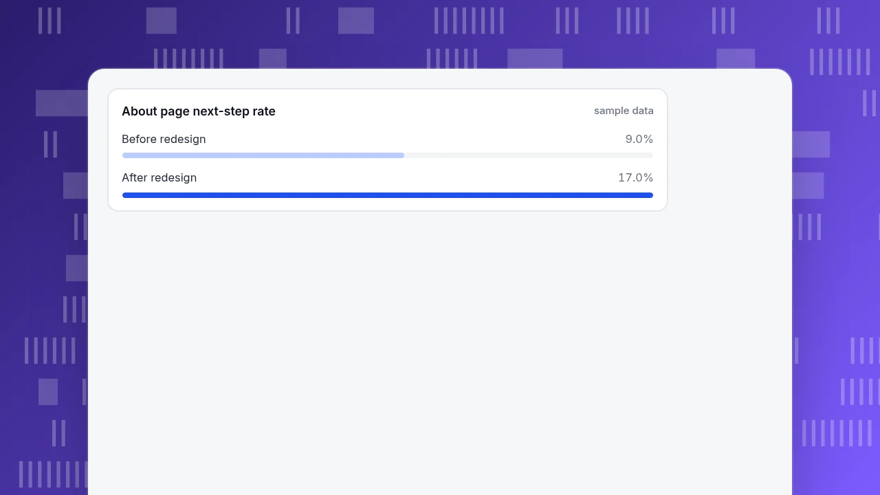
A fairer test is a before and after on the page's own next-step rate: the share of its visitors who go on to click the call to action.
| Before redesign | After redesign | |
|---|---|---|
| About page visitors | 1,200 | 1,150 |
| Visitors who clicked the next step | 108 | 196 |
| Next-step rate | 108 ÷ 1,200 = 9.0% | 196 ÷ 1,150 = 17.0% |
A two-proportion z-test on those counts gives z ≈ 5.8 and p well below 0.001, so the improvement is not chance. The redesign here added a three-sentence summary at the top, named photos of the team and one button instead of four links. It is still a before-and-after comparison, so check that traffic mix and season were similar in both periods before you credit the redesign.
About page next-step rate
sample dataWhat are the common About Us page mistakes?
- Starting with the founder's biography. Visitors want to know what you do for them first.
- Stock photos of unnamed "team members". NN/G found visitors prefer photos of real employees and products.
- Claims with no source. "Award-winning" with no award name is a trust problem, not proof.
- Several next steps. Four buttons mean none is chosen; pick one.
- Hiding contact details. Visitors still expect to find an address, email or phone.
- Never updating. Dates from 2019 and departed staff signal an unattended business.
- Measuring with the raw gap. Visitors who read About are not typical visitors; use before and after on the page's own next-step rate.
How to measure your About Us page in TapCub
Take the sample site above. It wants to know whether its About page sends people on, and where the ones who leave go. TapCub measures what visitors do on the site; it does not write the page or test headlines, so changes happen in your own editor.
- Read the page's behaviour. In Web analytics › Pages, find the About path. Its row shows visitors, entries, exits, average time, bounce rate and downstream pageviews (pageviews later in the same session after leaving that page), which show how often it sends people onward.
- Define the next step as a goal. In Web analytics › Goals, create a goal for your contact or booking confirmation then select it to read the entry-page breakdown, which shows how many bookings began on the About page. That is a raw figure: it says where interested people land, not that the page caused the booking.
- See the path. In All-platform analytics › Behavior › Behavior analysis, build a funnel such as About, then Pricing, then Booking confirmation. The result shows the rate versus the previous step and the median time between steps.
- See where attention goes. In All-platform analytics › Behavior › Heatmaps, open the About path and read clicks and scroll reach (scroll reach needs scroll depth switched on in autocapture). If nobody scrolls to the people section, move it up.
- Mark the redesign. Add an annotation in Configuration › Annotations on the day you change the page, and compare equal-length periods.
- Know the boundary. TapCub cannot split traffic between two versions of a page; run before-and-after comparisons, or use a separate testing tool.
FAQ
What should be included in an About Us page?
A summary of who you are and what you do, the story of why you exist, proof that can be checked, the real people behind the business, and one clear next step with contact details. Add mission and values only if they change how you act.
How long should an About Us page be?
Long enough to answer the three questions: who you are, why to trust you, what to do next. NN/G recommends a short summary on the main page and longer topics such as history, leadership and careers on their own sub-pages, so the main page stays quick to read.
What makes a good About Us page?
Plain language, specific facts with dates, real names and photos, a source for each claim and a single call to action. A good page is easy to verify; a weak one is full of adjectives.
How do I write an About Us page for a small business?
Start with one sentence on what you do and for whom, then why you started, then a photo and a short bio of the people who do the work, then how to reach you. Use the local-business example above, and add one specific fact such as the year you opened.
Do About Us pages affect conversions?
They can, but the raw gap between visitors who read the page and those who did not overstates the effect, because interested people go looking for it. Measure the page's own next-step rate before and after a change.
Sources
- Nielsen Norman Group. 'About Us' Information on Corporate Websites: User Research Findings. What visitors look for, and the role of real photos and balanced testimonials.
- Nielsen Norman Group. Great Summaries on 'About Us' Pages Engage Users and Build Trust. Summary at the top of the main page, long topics on sub-pages.
- Stanford Web Credibility Project. Stanford Guidelines for Web Credibility. Show a real organisation, make contact easy, show expertise.
- Nielsen Norman Group. How Users Read on the Web. Visitors scan pages instead of reading word by word.
Was this article helpful?
We use your answers to fix and expand this page.
Couldn’t send. Please try again in a minute.
Thanks for the feedback. We’ll use it to improve this page.You’ve already sent feedback on this page. Thanks.

Product Analyst
Focuses on event analysis, conversion funnels, and retention, using clear metric definitions and structured analysis to explain product performance.