Try it on your own data
Every report in this article is in the free plan. One snippet for web and apps, up to 10 sites.
Start freeTo write a user guide, start from the questions customers already ask: sort the last 90 days of support tickets into task categories, write one section per category in a fixed skeleton (title, before you start, numbered steps, result, if it did not work), test it with five people who have not seen the product, and measure tickets per 1,000 active users against categories you did not document. In the sample, four sections covered 70% of tickets.
What you will learn
- Write for the top ticket categories first: in the sample, four task sections covered 70% of 400 tickets
- Write steps with one action each, a named control and a visible result, because users read only about 20% of a page
- Credit the guide only with the excess over uncovered categories: -44.0% versus -12.5% in the sample, about 31 points
What is a user guide, and how is it different from a manual or a tutorial?
A user guide is task-based documentation that tells a customer how to get something done with your product, step by step. Its test is simple: a person with a goal opens it, follows it and succeeds without asking anyone. The words "user guide", "user manual" and "help article" overlap, but the shape of the content differs.
| Type | Answers | Reader | Typical shape |
|---|---|---|---|
| User guide | "How do I do X?" | Someone mid-task | Numbered steps for one task, with the result stated |
| Tutorial | "Teach me the basics" | A new user | A guided path through one realistic project |
| Reference | "What does this setting do?" | An experienced user | Complete lists of fields, options and limits |
| Troubleshooting | "Why is it not working?" | Someone stuck | Symptom, cause, fix |
Most "user guides" fail because they try to be all four at once. This page treats the guide as the task document and keeps the others separate and linked. The measure of success is not page count but support tickets avoided: each section should map to a question your customers actually ask. Training your team to point customers to the right section is covered in customer service training.
How do you decide what the user guide should contain?
Start from the questions people already ask, not from a feature list.
- Collect the last 90 days of support contacts: tickets, chats, emails.
- Give each a category. Use ten categories or fewer, named as tasks ("reset a password", not "account issues").
- Count and sort. Work out each category's share and the running total.
- Write for the top categories first. They are where the saved tickets are.
- Keep an "other" bucket. If it grows past about 15%, your categories are too coarse.
Sample data: 400 tickets in 90 days.
| Category | Tickets | Share | Running total |
|---|---|---|---|
| Reset password | 96 | 24.0% | 24.0% |
| Invite teammates | 72 | 18.0% | 42.0% |
| Connect a data source | 64 | 16.0% | 58.0% |
| Export a report | 48 | 12.0% | 70.0% |
| Billing and invoices | 44 | 11.0% | 81.0% |
| Notification settings | 30 | 7.5% | 88.5% |
| Other | 46 | 11.5% | 100.0% |
The first four categories account for 70% of the tickets (96 + 72 + 64 + 48 = 280, and 280 ÷ 400 = 70%). That is the guide's first release: four task sections, not forty. Ignore the temptation to document features nobody asks about.
What does a good user guide outline look like?
Use the same skeleton for every task so readers learn where things are. Each part has a job, and a ticket type it targets.
| Section | What goes in it | Rule | Targets |
|---|---|---|---|
| Title | The task as the user would say it: "Invite a teammate" | Verb first, no product jargon | Search and navigation |
| Before you start | Permissions, prerequisites, time needed | List only what blocks the task | "I can't see the button" tickets |
| Steps | Numbered, one action each, ending at the visible result | 3 to 9 steps; split longer tasks | "How do I…" tickets |
| Result | What the user should see when it worked | One sentence, with the screen name | "Did it work?" tickets |
| If it didn't work | Two or three common symptoms with fixes | Symptom, cause, fix | Repeat contacts |
| Related tasks | Links to the next likely task | Two or three at most | Follow-up tickets |
Put a short quick start before the task sections: five steps or fewer to the first success, so a new user is not asked to read everything. Add a glossary only if you cannot avoid a term; otherwise rewrite the term out.
| Section | What goes in it | Ticket type it targets |
|---|---|---|
| Title | The task in the user's words, verb first | Search and navigation |
| Before you start | Permissions and prerequisites that block the task | "I can't see the button" |
| Steps | 3 to 9 numbered steps, one action each | "How do I..." |
| Result | What the user should see when it worked | "Did it work?" |
| If it didn't work | 2 or 3 symptoms with cause and fix | Repeat contacts |
| Related tasks | Two or three links to the next likely task | Follow-up tickets |
Use the same skeleton for every task so readers learn where things are.
How should you write the steps?
Readers do not read; they scan. Nielsen Norman Group's study of 45,237 page views from 25 users, collected in 2005, found that users have time to read at most 28% of the words on an average web page during a visit, and that 20% is more likely (Nielsen Norman Group). Write so that the 20% they read is the right 20%: the step verbs and the buttons.
Microsoft's style guide gives concrete rules for step-by-step instructions (Microsoft Style Guide):
- Use a numbered list for multi-step procedures, and a separate step for each instruction; short steps in the same place on screen can be combined.
- If there could be confusion, say where the action takes place before describing it.
- Start each step with an imperative verb, and use a complete sentence.
- Include the action that completes the procedure, such as selecting Apply.
- Do not overwhelm: try to fit all the steps on one screen.
- Make headings parallel, and do not let an introductory sentence repeat the heading.
Rewrite example. Before: "The user should navigate to the settings area and then they will find the option to add team members which can be clicked." After:
- In the left menu, select Settings.
- Select Team, then Invite member.
- Enter the person's email address and choose a role.
- Select Send invite. The person appears in the list as Pending.
The "after" version has four verbs, four named controls and a visible result. Check every step against this: is there one action, a named control and, at the end, an observable outcome?
How do you write the "if it didn't work" part?
Keep it as a table of symptoms, because people search by what they see.
| Symptom | Likely cause | Fix |
|---|---|---|
| "Invite member" is greyed out | Your role cannot invite | Ask an admin to change your role or send the invite |
| Invite sent but nothing arrives | Wrong address, or spam filter | Check the address; ask the person to check spam; resend |
| Person appears twice | Two invitations to different addresses | Remove the unused one under Team |
Two rules: every symptom is a thing the reader can observe, and every fix is an action, not advice ("be careful with email addresses"). If a symptom keeps producing tickets after the guide ships, the fix text is wrong or the symptom is not specific enough.
How do you test a user guide before publishing it?
Give the guide to someone who has not seen the product and watch. Nielsen's model of usability testing says the share of problems found with n testers is 1 − (1 − L)ⁿ, where L is the share a single tester finds; with L = 31% five testers find about 84% (the article rounds to 85%) (Nielsen Norman Group, 2000). Five people, run one at a time, is a sensible size for a guide.
Protocol, for each task:
- Give the person the goal ("add a teammate"), not the steps.
- Let them use only the guide. Do not help; take notes at each hesitation.
- Record completed without help (yes or no), time to finish and the step where they paused or erred.
- Fix the guide at each pause, not the person.
- Re-test the changed steps with new testers.
A working bar: at least 4 of 5 complete without help. If 2 of 5 stall at step 3, step 3 is the bug.
How do you measure whether the guide cut support tickets?
Raw ticket counts mislead, because your user base changes. Normalise per 1,000 active users and compare against categories you did not touch.
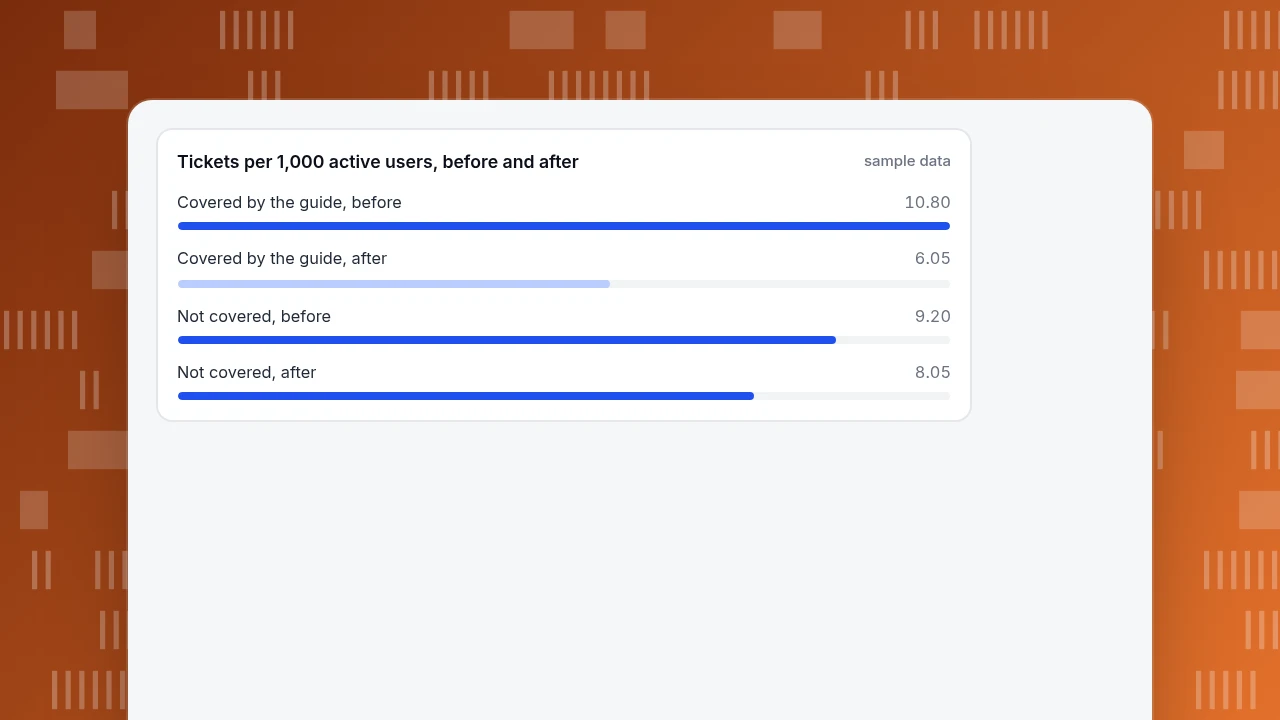
Sample data: before the guide, 400 tickets and 20,000 active users, which is 400 ÷ 20,000 × 1,000 = 20.0 per 1,000. After, 310 tickets and 22,000 active users: 310 ÷ 22,000 × 1,000 = 14.1 per 1,000, a 29.5% fall. (The raw count fell only 22.5%, because the user base grew.) By category:
| Category | Guide written | Before, per 1,000 | After, per 1,000 | Change |
|---|---|---|---|---|
| Reset password | Yes | 4.80 | 1.82 | −62.1% |
| Invite teammates | Yes | 3.60 | 2.50 | −30.6% |
| Export a report | Yes | 2.40 | 1.73 | −28.0% |
| Covered: three categories | 10.80 | 6.05 | −44.0% | |
| Connect a data source | No | 3.20 | 2.82 | −11.9% |
| Billing and invoices | No | 2.20 | 1.91 | −13.2% |
| Notification settings | No | 1.50 | 1.27 | −15.2% |
| Other | No | 2.30 | 2.05 | −11.1% |
| Not covered: four categories | 9.20 | 8.05 | −12.5% |
The not-covered categories fell 12.5% with no guide. That is your control: other things changed (product fixes, a seasonal dip, a better onboarding email). The guide's effect is the excess: −44.0% versus −12.5%, about 31 percentage points. Credit the guide with that, not with the full 44%.
Pair the ticket count with two supporting numbers: the guide pages' views and how many of those visits end without a contact. A guide that is read and still produces tickets has unclear steps; a guide nobody opens has a findability problem.
Tickets per 1,000 active users, before and after
sample dataHow to connect the guide to customer questions with TapCub
TapCub does not write or host your guide. It helps you find what to write and see whether it works, if you use TapCub live chat on the same site and the same visitor ID. The same ticket-first approach works with chat conversations:
- Find the questions. Chats that reach a person are labelled with the reason: no knowledge match, the model could not answer, the visitor asked, the turn limit or an agent took over. In the knowledge base's Draft inbox, Generate from conversations turns visitor questions and agent replies from conversations resolved in the last 30 days into draft Q&A entries (once every 24 hours per site, one AI call per batch); nothing goes live until you approve it.
- See which pages prompt the questions. Live chat › Reports lists the top 10 hot pages: the page where the visitor started the chat. A task page with many chat starts needs a clearer guide next to it.
- Put the answer where the question comes up. In Live chat › Knowledge base, a pinned Q&A entry appears in the visitor-facing FAQ. Opening the answer does not create a conversation and does not use quota; only Not solved or a request for a person opens one.
- Read the effect. The same reports page shows the knowledge base hit rate and the number of conversations. Web analytics › Pages shows views of the guide page itself.
- Know the boundary. TapCub does not count your help-desk tickets; bring those numbers from your own system and normalise per 1,000 active users as above. Use enable live chat if the site does not have chat yet.
FAQ
How do you write a user guide?
Start from the questions customers already ask: categorise the last 90 days of tickets and write for the top categories first. For each task, use a title in the user's words, a short "before you start", numbered steps with one action each, a result statement and an "if it didn't work" table. Test with five people who have not seen the product.
What should a user guide include?
A quick start of five steps or fewer, one section per task in a fixed skeleton, a symptom table for problems, links to related tasks and, only if needed, a short glossary. Leave out features nobody asks about; in the sample, four task sections covered 70% of the tickets.
What is the difference between a user guide and a user manual?
In practice the terms overlap. A user guide usually means task-based instructions ("how do I do X"), while a manual can also include reference material such as complete option lists and specifications. What matters is that each page serves one reader need: do a task, learn the basics, look something up, or fix a problem.
How long should a user guide be?
As long as the task needs, no longer. Aim for 3 to 9 steps per task, and split anything longer. Microsoft's style guidance suggests trying to fit all the steps of a procedure on one screen. Readers scan, and one study found they read at most about 28% of the words on a page.
How do you know if a user guide works?
Test it with five people before publishing, and after publishing compare tickets per 1,000 active users for the covered categories against categories you did not document. In the sample, covered categories fell 44.0% while uncovered ones fell 12.5%, so the guide's share was about 31 percentage points.
Sources
- Nielsen Norman Group. How Little Do Users Read? — 45,237 page views from 25 users (2005); 28% at most, 20% likely. Checked 2026-11-20.
- Microsoft. Writing step-by-step instructions — Microsoft Writing Style Guide. Checked 2026-11-20.
- Nielsen Norman Group. Why You Only Need to Test with 5 Users — the formula 1 − (1 − L)ⁿ and L = 31%. Checked 2026-11-20.
Was this article helpful?
We use your answers to fix and expand this page.
Couldn’t send. Please try again in a minute.
Thanks for the feedback. We’ll use it to improve this page.You’ve already sent feedback on this page. Thanks.

Product Experience Specialist
Writes about product experience, practical workflows, and growth, turning complex processes into clear steps for everyday decisions.