Try it on your own data
Every report in this article is in the free plan. One snippet for web and apps, up to 10 sites.
Start freeCall to action keywords are the verbs at the start of button labels: Learn and Read early in a decision, Compare and Download in the middle, Start, Book and Get at the end. Pick the verb that matches how much the reader is ready to give, name what happens next, and judge any wording test on sign-ups per visitor, not on clicks alone.
What you will learn
- Match the verb to the stage: Learn or Read for awareness, Compare or Download for consideration, Start, Book or Get for decision
- One primary verb per page, and a label that says what happens next, such as Book a 15-minute demo rather than Submit
- In the sample, B earns 15% more clicks (p 0.005) but sign-ups per visitor are not demonstrably higher (p 0.52); judge on sign-ups
What makes a call to action word work
A call to action (CTA) keyword is the verb at the front of a button or link label: Start, Get, Book, Download, Compare. The verb tells the reader what happens when they click. Nielsen Norman Group's guidance on interface copy (March 2019) puts it as a rule: lead with a verb or verb phrase that clearly states what will happen after the command is selected, and add a noun when the verb alone is ambiguous, such as "Delete folder" rather than "Delete".
So a good CTA has three parts: a verb, an object and, where it helps, the cost or outcome. "Book a 15-minute demo" has all three. "Submit" has one and tells the reader nothing about the result. Our glossary entry on call to action covers the definition; this article is about choosing the words and proving they work.
The choice of verb is not magic. A verb that fits where the reader is in their decision gets clicked; the same verb in the wrong place gets ignored. That is why the list below is organised by funnel stage instead of by popularity.
CTA verbs by funnel stage
Match the commitment the verb asks for to what the reader is ready to give. A visitor reading a guide is not ready to "Buy"; a visitor on a pricing page is not ready to be told to "Learn".
| Stage | The reader is asking | Verbs that fit | Example labels | What to measure |
|---|---|---|---|---|
| Awareness | What is this? | Learn, Read, See, Explore, Watch | "See how it works", "Read the guide" | Click-through to the next page; scroll depth |
| Consideration | Is it right for me? | Compare, Try, Preview, Download, See pricing | "Compare plans", "Download the checklist" | Clicks to pricing; downloads per visitor |
| Decision | Can I get it, and what does it cost? | Start, Get, Book, Buy, Request, Subscribe | "Start free trial", "Book a demo", "Get a quote" | Click-through, then sign-ups per visitor |
| Retention | How do I get more value? | Upgrade, Renew, Add, Invite, Share | "Upgrade to Pro", "Invite a teammate" | Click-through among existing users; paid conversions |
Three practical rules follow from the table.
- One primary verb per page. If a page has "Start free trial", "Book a demo" and "Get a quote" at equal weight, readers have to decide between three commitments before they decide whether to commit at all. Pick the one that matches the page's stage and make the others secondary links.
- Say what happens next. "Get started" is a direction, not an outcome. "Start free trial" and "Book a 15-minute demo" name the thing the reader receives.
- Lower the commitment for cold traffic. A visitor from a search result for a how-to query should see "Read the setup guide" before "Start free trial". Send the verb that matches the intent of the query.
| Stage | Verbs that fit | What to measure |
|---|---|---|
| Awareness | Learn, Read, See, Explore, Watch | Click-through to the next page; scroll depth |
| Consideration | Compare, Try, Preview, Download, See pricing | Clicks to pricing; downloads per visitor |
| Decision | Start, Get, Book, Buy, Request, Subscribe | Click-through, then sign-ups per visitor |
| Retention | Upgrade, Renew, Add, Invite, Share | Click-through among users; paid conversions |
A starting point based on the commitment each verb asks for. Test it on your own pages.
What the evidence says about CTA wording
Most advice on CTA words is opinion with a screenshot. Three pieces of evidence are worth knowing, and each has limits.
Specific labels beat generic ones. In the NN/g article, "Next" and "Previous" are acceptable in some places but "can be vague and too general", and for confirmation dialogs the article recommends a label that names the action, such as "Discard", instead of "OK". This is guidance based on usability research, not a conversion benchmark.
Wording tests can move click-through, but the sample is not always shown. MarketingExperiments (MECLABS), in an article of 31 March 2014, reported a test of five phrases on a button in a banner on a software company's page. Against "Start Free Trial", "Try Now" reduced click-through by 26% and "Get Started Now" raised it by more than 11%. The article does not report traffic, absolute rates or confidence, so treat it as evidence that wording can matter, not as a number to expect on your site.
A good label that cannot be seen or tapped will not be clicked. WCAG 2.2 sets a minimum target size of 24 by 24 CSS pixels for pointer inputs (with exceptions such as inline links), and a contrast ratio of at least 4.5:1 for normal text, or 3:1 for large text (18 point, or 14 point bold). Test the button on a phone before you test the verb on it.
The lesson is to test your own wording, with a sample large enough to mean something. If the page itself is the problem, start with landing page conversion rate and come back to wording afterwards. The rest of this article shows how to test.
Words that quietly cost clicks
These patterns come up often, and each has a fix you can apply without a test.
| Pattern | Problem | Better |
|---|---|---|
| "Submit", "OK", "Click here" | Says nothing about the result; NN/g advises against a bare "OK" | "Send message", "Save changes", "Download the report" |
| Two equal-weight primary buttons | Readers must choose before they act | One primary button; secondary as a text link |
| "Learn more" on every card | Identical links cannot be told apart in a list | "Learn how routing works" |
| Asking for the commitment too early | Cold visitor is asked to buy | Match the verb to the stage |
| A long label that wraps on mobile | The button gets taller, the verb gets lost | Keep to about 2 to 4 words |
How to measure click-through per variant
To compare two CTA labels you need the same two numbers for each: how many people saw it, and how many clicked.
Click-through rate = clicks ÷ visitors who saw the button
Counting visitors is better than counting page views, because one visitor reloading the page would otherwise count twice. Then add the number that matters more, the one after the click:
Sign-ups per 10,000 visitors = sign-ups ÷ visitors × 10,000
A label that earns more clicks but fewer sign-ups has attracted the wrong people, so judge the test on the second number and use the first to find out why.
For each click, record the same fields every time: an event name (cta_click), the button's id, its label, the variant (A or B), the funnel stage and the page. Keep the variant and the label as separate properties so you can change the wording later without losing the comparison.
A worked example: one test, from sample size to result
Sample data: the pricing page's primary button says "Start free trial" (variant A) and the test compares "Get started" (variant B). The baseline click-through rate is 4.0% of visitors. You want to be able to detect a 15% relative improvement (4.0% to 4.6%) with a two-sided 5% significance level and 80% power.
Step 1: sample size. For two proportions, n per variant = (z₀.₀₂₅ + z₀.₂)² × [p₁(1 − p₁) + p₂(1 − p₂)] ÷ (p₂ − p₁)², with z₀.₀₂₅ = 1.96 and z₀.₂ = 0.84. With p₁ = 0.040 and p₂ = 0.046 that is 17,940 visitors per variant. The 5% level and 80% power are the values MedCalc's sample size documentation uses in its worked example; they are common defaults, not rules.
Step 2: duration. At 1,500 visitors per variant per day, 17,940 visitors take 12 days. Run whole weeks so weekdays and weekends are balanced: two weeks.
Step 3: how the sample size changes. The same test for other effects shows why small differences need big samples:
| Baseline | Detect (relative) | Visitors per variant | Days at 1,500 / variant / day |
|---|---|---|---|
| 4.0% | +25% (to 5.0%) | 6,743 | 5 |
| 4.0% | +15% (to 4.6%) | 17,940 | 12 |
| 4.0% | +10% (to 4.4%) | 39,473 | 27 |
| 2.0% | +15% (to 2.3%) | 36,691 | 25 |
Step 4: the result. After 18,000 visitors per variant: variant A had 720 clicks (4.0%) and variant B 828 clicks (4.6%). The z-statistic is 2.81 and the p-value is 0.005, so the click-through difference is unlikely to be chance.
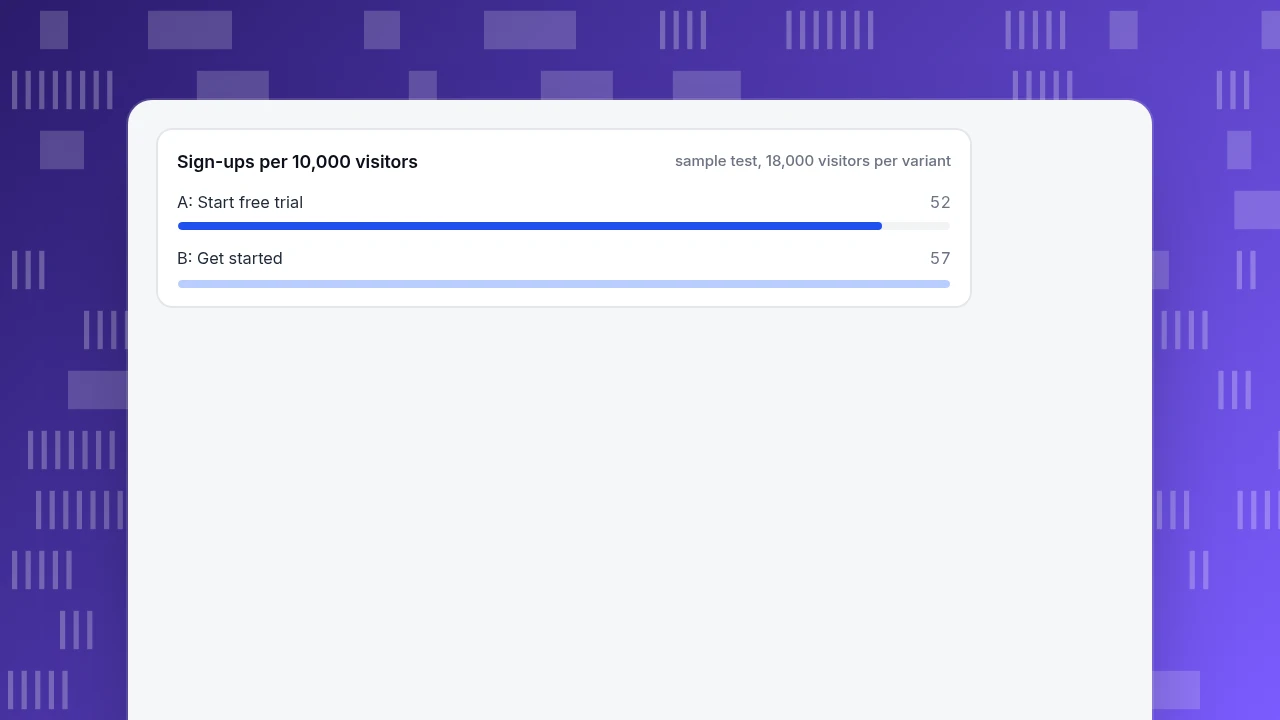
Step 5: look past the click. Of those clicks, 94 of A's 720 became sign-ups (13.1%) and 103 of B's 828 did (12.4%). Per 10,000 visitors that is 52.2 sign-ups for A and 57.2 for B, a 9.6% relative difference. The p-value for sign-ups per visitor is 0.52, so the data cannot tell the two apart: the new label earns 15% more clicks but not demonstrably more sign-ups. Keep running the test, or treat the labels as equal and choose on other grounds.
The decision rule is to pick the winner on the metric you care about, not the one that moved. Stopping early is the other trap: if you had looked at 10,000 visitors per variant and stopped as soon as the p-value dipped below 0.05, you would be more likely to ship a change that does nothing.
Sign-ups per 10,000 visitors
sample test, 18,000 visitors per variantA test plan you can copy
- Write the hypothesis in one sentence. "Changing 'Start free trial' to 'Get started' on /pricing raises sign-ups per visitor."
- Pick one primary metric. Sign-ups per visitor. Click-through is a diagnostic.
- Calculate the sample size before you start. Use the formula above or a calculator, and write down the number of visitors and the end date.
- Change one thing. Do not change the colour, the position and the verb at once.
- Split visitors at random with your testing or deployment tool, and record the variant on every click and sign-up.
- Run full weeks and do not peek. Check for broken tracking in the first two days, but do not decide until the planned end date.
- Record the result, even when it is "no difference". It keeps the same idea from being tested again.
How to measure CTA clicks in TapCub
Take the pricing-page test above. TapCub measures the clicks and what happens after them; it does not split traffic or declare a winner, so run the split in your testing tool or page code and pass the variant to TapCub.
- Name the click. In the button's click handler, call
tapcub.track('cta_click', { id: 'pricing-primary', label: 'Get started', variant: 'B', stage: 'decision' }). Properties keep at most 20 keys, and strings are cut at 200 characters. Do not put what the visitor typed into them. - Create a goal for each variant. In Web analytics › Goals, add an event goal named
cta_click; the optional property filter, for examplevariant=B, counts a conversion only when the property matches. Make a second goal for the sign-up event. - Count clicks by variant. In All-platform analytics › Behavior › Behavior analysis, use property analysis on
variantwith the eventcta_click, which lists the count for each value. Compare it with visitors in Web analytics › Overview for the same dates. - Look at the step after the click. Build a funnel in All-platform analytics › Behavior › Behavior analysis from
cta_clickto your sign-up event, and read the rate between the two steps for each variant. This is the 13.1% against 12.4% comparison from the example. - Filter out bots. TapCub counts real visitors and bots separately, so the visitor counts in your denominator are people, not crawlers.
TapCub does not run A/B tests or choose a winner: the arithmetic in step 4 and 5 of the example is yours to run, and the tracking above gives you the counts to put into it.
FAQ
What are call to action keywords?
Call to action keywords are the action verbs at the start of button and link labels, such as Start, Get, Book, Download, Compare and Subscribe. They tell the reader what clicking will do. Choose the verb to match how much commitment the reader is ready to give at that point in their decision.
What are the best CTA words?
There is no universal best word. Specific labels that say what happens next, such as "Download the checklist" or "Book a 15-minute demo", are generally clearer than "Submit" or "OK". Which verb performs better on your page depends on the audience and the stage, so test two candidates against sign-ups per visitor.
How many words should a CTA have?
Two to four words fits most buttons, and it keeps the label on one line on a phone. Use more only when a noun is needed to make the verb clear, as in "Delete folder" rather than "Delete". If a label needs a sentence to be understood, put the explanation above the button.
How do you test a call to action?
Change one thing, split visitors randomly between two versions, record the variant on every click and sign-up, calculate the sample size before you start, and run whole weeks. Judge the result on sign-ups per visitor, not clicks alone. A change of 15% on a 4% baseline needs about 17,940 visitors per variant.
Does changing a CTA word really change conversions?
Sometimes. A 2014 MECLABS test reported changes of −26% and more than +11% in click-through between wordings, but it did not publish sample sizes. Click-through often changes more than sign-ups, and the sign-up difference is the one that pays. Measure both on your own pages.
Sources
- Nielsen Norman Group, UI Copy: UX Guidelines for Command Names and Keyboard Shortcuts, 3 March 2019. Verb-led labels, avoiding generic labels, "Delete folder" example. Checked 2026-11-20.
- MarketingExperiments (MECLABS), Call-to-Action Button Copy: How to reduce clickthrough rate by 26%, 31 March 2014. Relative click-through changes for "Try Now" and "Get Started Now" against "Start Free Trial"; traffic and confidence not reported. Checked 2026-11-20.
- W3C, Understanding Success Criterion 2.5.8: Target Size (Minimum) and Success Criterion 1.4.3: Contrast (Minimum), WCAG 2.2. 24 by 24 CSS pixels; 4.5:1 and 3:1 contrast. Checked 2026-11-20.
- MedCalc, Sample size calculation: comparison of proportions. Inputs alpha, beta and the two proportions; the example uses alpha 0.05 and power 80%. Checked 2026-11-20.
Was this article helpful?
We use your answers to fix and expand this page.
Couldn’t send. Please try again in a minute.
Thanks for the feedback. We’ll use it to improve this page.You’ve already sent feedback on this page. Thanks.

Product Experience Specialist
Explores usability, user journeys, and feature adoption through practical examples of onboarding and everyday product use.