Try it on your own data
Every report in this article is in the free plan. One snippet for web and apps, up to 10 sites.
Start freeA good chat button is at least 44 by 44 pixels (56 is better), has 3:1 contrast, sits in a corner with no fixed element in it, and carries a label that gives a reason to click. In the sample test, a label naming a question and a person opened chat 3.7% of the time against 2.2% for an icon alone. This guide gives the rules and a test method that avoids reading noise.
What you will learn
- Use a 56-pixel bubble with 8–16 px of space: WCAG asks 24 px at AA and 44 px at AAA, Material asks 48dp
- Check the corner for cookie banners, back-to-top and sticky add-to-basket bars before choosing; keep the bubble off the main action on mobile
- Compare variants with intervals: in the sample only three of four label differences are clear, and a 3.0% vs 3.5% test needs about 19,700 visitors per variant
What a chat button has to do
A chat button has three jobs: be noticed, be understood in a glance, and stay out of the way of what the visitor came to do. Most design advice optimises the first and forgets the third. A button that wins 3% more clicks but covers the add-to-basket bar on a phone loses money.
Design decisions come down to six choices: size, contrast, position, label, mobile behaviour and what happens when no agent is online. The sections below give a number or a rule for each, and a method for testing click rates that avoids reading noise as a result. For ready-made label wording, see chat with us button; this article is about how to choose and test.
Size: how big the button and its target should be
Standards give you hard minimums. The Web Content Accessibility Guidelines (WCAG) 2.2 require, at level AA, that pointer targets be at least 24 by 24 CSS pixels, with exceptions for spacing and inline links. The stricter level AAA criterion asks for 44 by 44 CSS pixels. Material Design sets the smallest tappable area at 48 density-independent pixels (dp) and lists floating action buttons in three sizes: 40dp, 56dp and 96dp.
Turn that into a rule:
| Element | Minimum | Recommended |
|---|---|---|
| Tap target on mobile | 44 × 44 px | 48 px or larger |
| Floating chat bubble | 40 px | 56 px |
| Space to the nearest other control | 8 px | 16 px |
| Close or minimise control inside the window | 44 × 44 px | 48 px |
A 56-pixel bubble clears every threshold with room to spare. Anything under 44 pixels will fail the stricter standard and miss thumbs, especially when placed beside a back-to-top button or a cookie banner.
Contrast and a visible label
WCAG 1.4.11 asks that user interface components, including the parts of a control needed to identify it, have a contrast ratio of at least 3:1 against the adjacent colours. A pale grey bubble on a white page fails that test. Test the bubble against the real background, including any sticky bars it overlaps, and test it in both the default and focus states.
An icon alone is a design risk. The sample test below shows why: the icon-only button has the lowest click rate of the five labels. If you keep the icon, give it an accessible name such as "Chat with us" so a screen reader announces it, and add a visible label at least on the first visits or after a delay.
Position: where visitors look and where the page is busy
The common choices are bottom right, bottom left, the middle of the right edge and a link in the header. The bottom-right corner is conventional in left-to-right languages, which is part of why it works: visitors have learned to look there. But conventions collide with other fixed elements, so check your own page before you pick a corner.
List every fixed or sticky element on your key pages: cookie banner, back-to-top button, sticky add-to-basket bar, promo strip. If any of them lives in the same corner, move the bubble to the other corner, or lift it by the height of the bar. On mobile, never let the bubble overlap the main action button.
Sample data: a four-way position test on a store, 12,000 visitors in each group.
| Position | Visitors | Chat opens | Open rate |
|---|---|---|---|
| Bottom right | 12,000 | 360 | 3.0% |
| Bottom left | 12,000 | 300 | 2.5% |
| Right edge, middle | 12,000 | 264 | 2.2% |
| Header link only | 12,000 | 96 | 0.8% |
Bottom right beats bottom left by 0.5 points. Is that real? The standard error of the difference is √(0.03 × 0.97 ÷ 12,000 + 0.025 × 0.975 ÷ 12,000) = 0.21 points, so the 95% interval is 0.5 ± 0.41, which is 0.09 to 0.91 points. It excludes zero, but only just; treat it as a probable small effect. Bottom right against the right edge is 0.8 points with an interval of 0.40 to 1.20: clearer. The header link alone, at 0.8%, is far behind: a hidden control does not get used.
| Position | Visitors | Chat opens | Open rate |
|---|---|---|---|
| Bottom right | 12,000 | 360 | 3.0% |
| Bottom left | 12,000 | 300 | 2.5% |
| Right edge, middle | 12,000 | 264 | 2.2% |
| Header link only | 12,000 | 96 | 0.8% |
Sample data. Bottom right beats bottom left by 0.5 points, 95% interval 0.09 to 0.91.
Copy: five labels compared
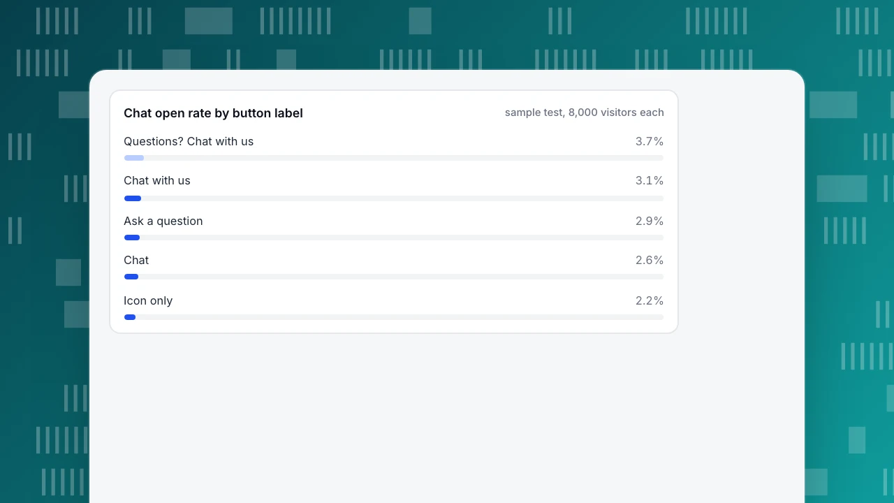
Sample data: five label variants shown to 8,000 visitors each, on the same page and position.
| Label | Visitors | Chat opens | Open rate | Difference from icon only (95% interval) |
|---|---|---|---|---|
| Icon only | 8,000 | 176 | 2.2% | baseline |
| "Chat" | 8,000 | 208 | 2.6% | +0.4 (−0.07 to +0.87) |
| "Ask a question" | 8,000 | 232 | 2.9% | +0.7 (0.21 to 1.19) |
| "Chat with us" | 8,000 | 248 | 3.1% | +0.9 (0.40 to 1.40) |
| "Questions? Chat with us" | 8,000 | 296 | 3.7% | +1.5 (0.98 to 2.02) |
Read the last column, not just the rates. "Chat" at 2.6% looks better than the icon, but its interval includes zero, so with this sample you cannot say it is. The two longest labels clearly beat the icon. The winning label names a reason to click (a question) and a person to talk to (us). A label that says only what the button is adds little.
Opens are not the goal. A copy that opens chats from people with no intent can raise opens and lower the share that go on to order. Judge each variant on conversations started per 1,000 visitors and on the goal conversion of people who chatted, and treat opens as a first filter.
Chat open rate by button label
sample test, 8,000 visitors eachMobile: smaller screens, sticky bars
On a phone the button competes with the keyboard, the browser toolbar and any sticky bar. Three rules:
- Keep the bubble clear of the main call-to-action; on a product page, raise it above the sticky add-to-basket bar.
- Do not show a teaser card that covers more than a quarter of the screen height.
- If chat does more harm than good on a page type, such as checkout, hide it there rather than shrink it.
Test hiding by page type: compare the conversion rate of checkout sessions with and without the bubble for two weeks each, and keep the version that converts better.
Keyboard and screen readers
The button must be reachable with the keyboard and announce a name. WCAG 2.4.11 asks that a focused element is not entirely hidden by author-created content, and its guidance names chat windows as a risk because they stay open on top of the page. Designs that pass push the page aside, move focus into the window until it is closed or let Escape close it so the hidden items can be reached again. Test it: tab through your page with the chat window open and check that you can always see where focus is.
When no agent is online
A button that opens an empty promise erodes trust. Decide what the button says outside staffed hours: either hide the "live" cues (a green dot) and change the label to something like "Leave a message", or open into a form that collects an email and a question. State the reply time you can keep.
How to run the test without fooling yourself
Click rates are small numbers, so samples need to be larger than intuition says. To detect a lift from 3.0% to 3.5% with 95% confidence and 80% power you need about 19,700 visitors per variant: n = (1.96 + 0.84)² × (0.03 × 0.97 + 0.035 × 0.965) ÷ 0.005² ≈ 19,700. To detect 3.0% to 4.0% you need about 5,300 per variant. A site with 5,000 visitors a week can only test large changes.
Rules for a clean test:
- Change one thing at a time: position or label, not both.
- Run for whole weeks so weekday patterns balance.
- Decide the sample size and metric before starting; do not stop when the lead looks good.
- Record the outcome as a difference with an interval, not as a single rate.
In TapCub
Take the sample store above and set it up in TapCub.
- In Live chat › Chat settings › Appearance, set the brand name, primary colour and logo, choose bottom right or bottom left for the bubble, and turn on Hide bubble on mobile if phones need it (a window narrower than 640 pixels or a mobile browser counts as a phone).
- Write the teaser text in Live chat › Chat settings › Greeting & translation. The teaser card appears about 4 seconds after a visitor arrives, once, and is not shown to visitors who already have a conversation.
- For your own button, call
tapcub.chat.open(),close()ortoggle(), and check thattapcub.chatexists first (the open chat from your button help page has the code). On pages like checkout, adddata-chat="false"to the script tag; analytics keeps working. The chat widget glossary page explains what the widget is. - Measure in Live chat › Reports › Conversion attribution, which compares visitors who chatted with those who did not and lists the pages where conversations start.
TapCub does not split-test button variants; it measures the result. Change one thing per period, or run the variants with your own testing tool, and compare conversations started and goal conversion for each period.
FAQ
Where should a chat button be placed?
Bottom right is the usual choice in left-to-right languages, but check for fixed elements in that corner, such as a cookie banner, a back-to-top button or a sticky add-to-basket bar. If one is there, use the other corner or raise the bubble. On mobile keep it clear of the main action button.
How big should a chat button be?
At least 44 by 44 pixels for a tap target; WCAG 2.2 requires 24 by 24 at level AA and 44 by 44 at AAA, and Material sets 48dp. A 56-pixel bubble clears all of them, with 8 to 16 pixels of space around it.
What text should a chat button say?
Name a reason and a person, such as "Questions? Chat with us". In the sample test it opened 3.7% against 2.2% for an icon alone. Test it with your own audience and judge it on conversations and conversions, not opens alone.
Should the chat button appear on mobile?
Yes on pages where chat helps, as long as it does not cover the main action. Hide it on pages where it hurts conversion, such as checkout, and compare conversion with and without it for two weeks each.
How many visitors do I need to test a chat button?
To detect 3.0% against 3.5% you need about 19,700 visitors per variant; 3.0% against 4.0% needs about 5,300. Fix the sample size first, run full weeks and report the difference with an interval.
Sources
- W3C, Understanding SC 2.5.8: Target Size (Minimum) (24 by 24 CSS pixels). Checked 2026-11-21.
- W3C, Understanding SC 2.5.5: Target Size (Enhanced) (44 by 44 CSS pixels). Checked 2026-11-21.
- W3C, Understanding SC 1.4.11: Non-text Contrast (3:1) and SC 2.4.11: Focus Not Obscured (Minimum). Checked 2026-11-21.
- Material Design 3, Structure and accessibility (48dp minimum target; floating action buttons 40, 56 and 96dp). Checked 2026-11-21.
Was this article helpful?
We use your answers to fix and expand this page.
Couldn’t send. Please try again in a minute.
Thanks for the feedback. We’ll use it to improve this page.You’ve already sent feedback on this page. Thanks.

Product Analyst
Focuses on event analysis, conversion funnels, and retention, using clear metric definitions and structured analysis to explain product performance.